
If you’ve been searching for how to design a blog homepage in WordPress without coding, you’ve probably already tried something that didn’t work out the way you pictured.
Maybe your homepage is live but looks nothing like the blogs you admire. Maybe you’re still staring at a default post feed wondering why visitors keep leaving in under ten seconds.
I’ve been exactly there. And I’m going to show you the exact blueprint I used to fix it, section by section, layer by layer, with real numbers attached.
This guide is part of our complete no-code WordPress website building roadmap, where we walk through every stage of building a professional blog from scratch without touching code. But this post goes deep on one specific page, the one that determines whether a first-time visitor stays or disappears forever.
Let’s start with the honest picture of what my homepage looked like before I fixed it.
How to Design a Blog Homepage in WordPress Without Coding
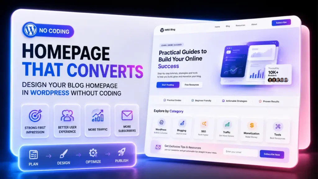
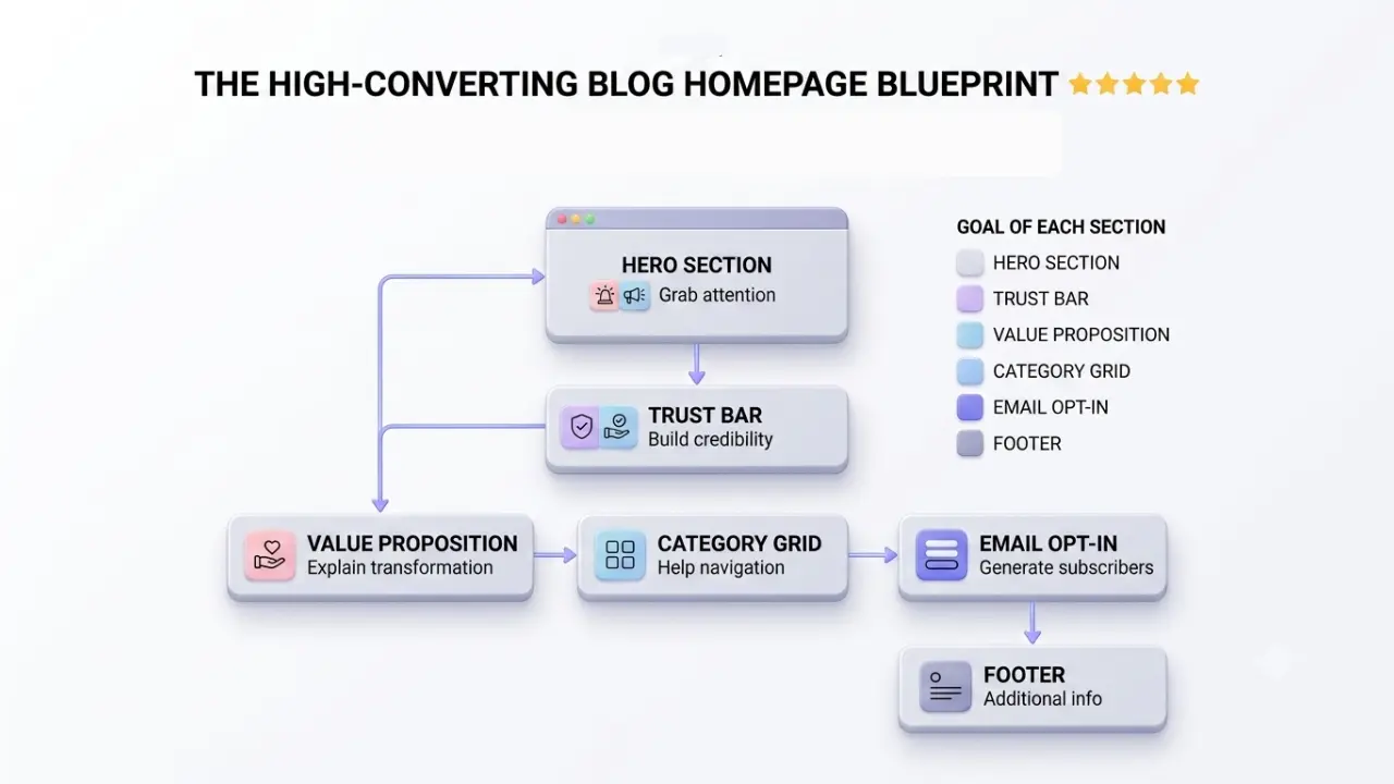
Designing a blog homepage in WordPress without coding starts by assigning a static homepage, then building a clear five-layer structure: Hero, Trust Bar, Value Proposition, Category Navigation, and Email Opt-In. The layout should also be optimized for mobile usability, speed, and consistent visual design.
| Homepage Element | What It Does | Beginner Action |
|---|---|---|
| Static Homepage | Gives you control over the homepage structure and content. | Set a custom Home page under Settings → Reading. |
| Hero Section | Explains who the blog helps and what visitors can expect. | Use one clear headline, supporting sentence, and primary CTA. |
| Trust Bar | Provides quick credibility signals before visitors continue. | Add concise, legitimate trust signals below the hero. |
| Value Proposition | Explains the reader’s problem and the transformation the blog offers. | Focus on the reader’s outcome rather than simply listing topics. |
| Category Navigation | Helps visitors discover relevant content and understand the site’s structure. | Use clear category cards linked to your main content areas. |
| Email Opt-In | Turns interested visitors into subscribers through a specific offer. | Promote one useful lead magnet with a clear CTA and email form. |
| Mobile Optimization | Ensures the homepage remains usable on smaller screens. | Check typography, columns, buttons, spacing, and responsive layouts. |
Key points on how to design a WordPress homepage
Before and after – What my WordPress homepage actually looked like
I want to give you a real visual here, not a vague “it was bad.”
Before :
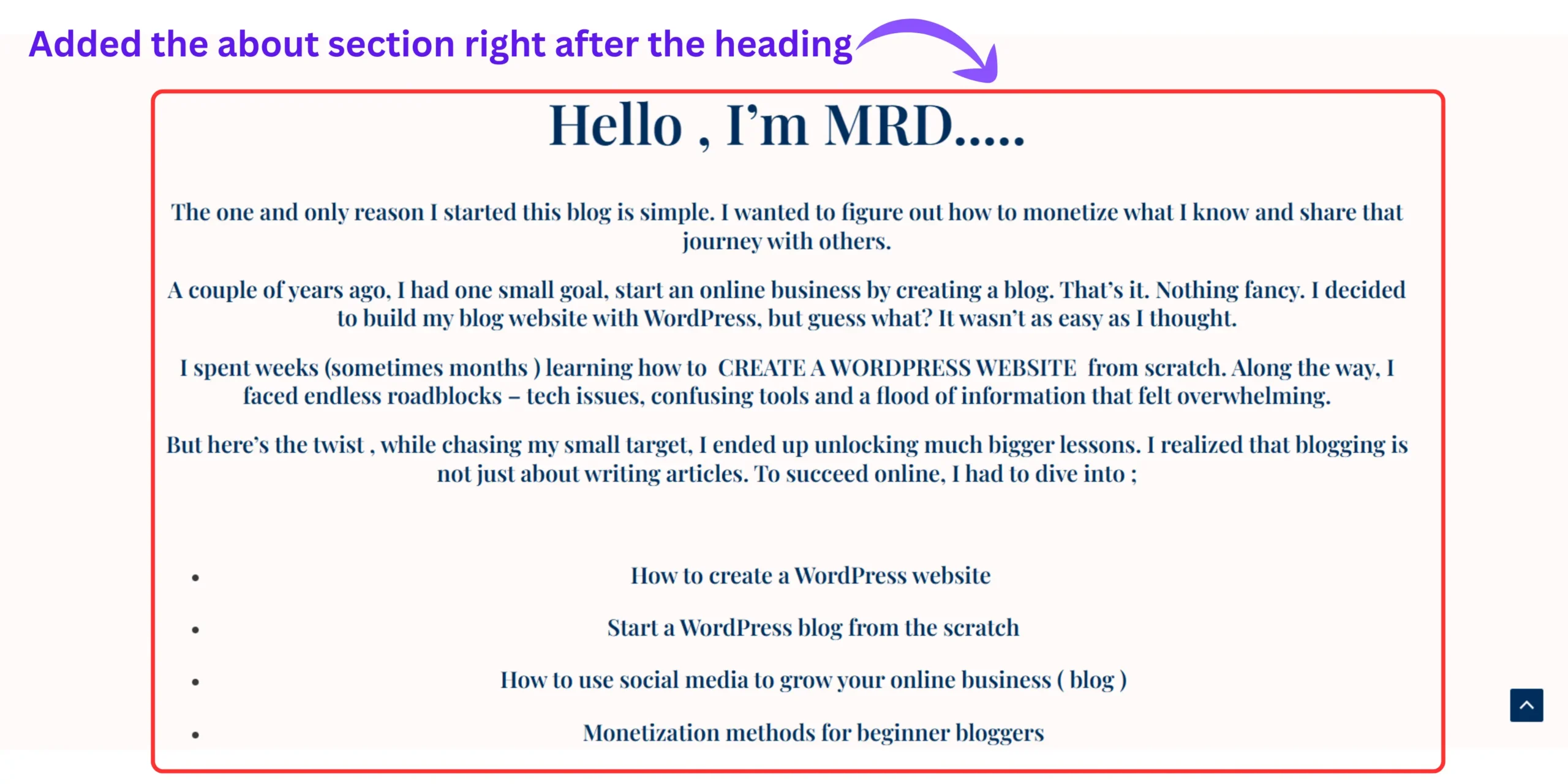
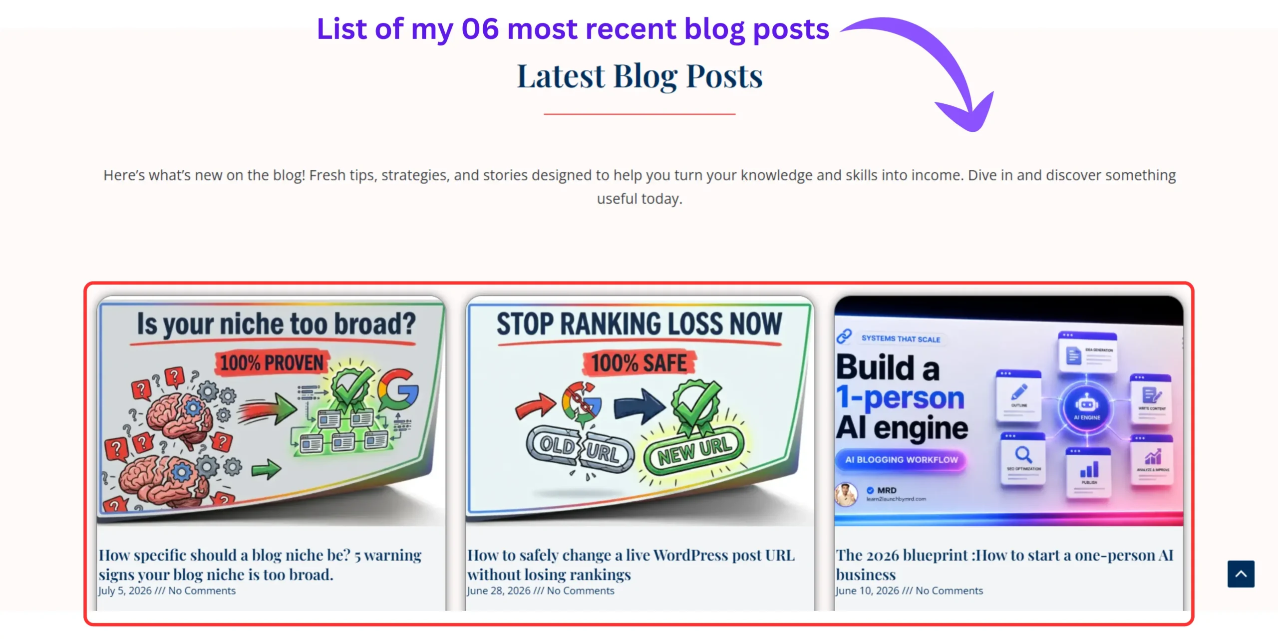
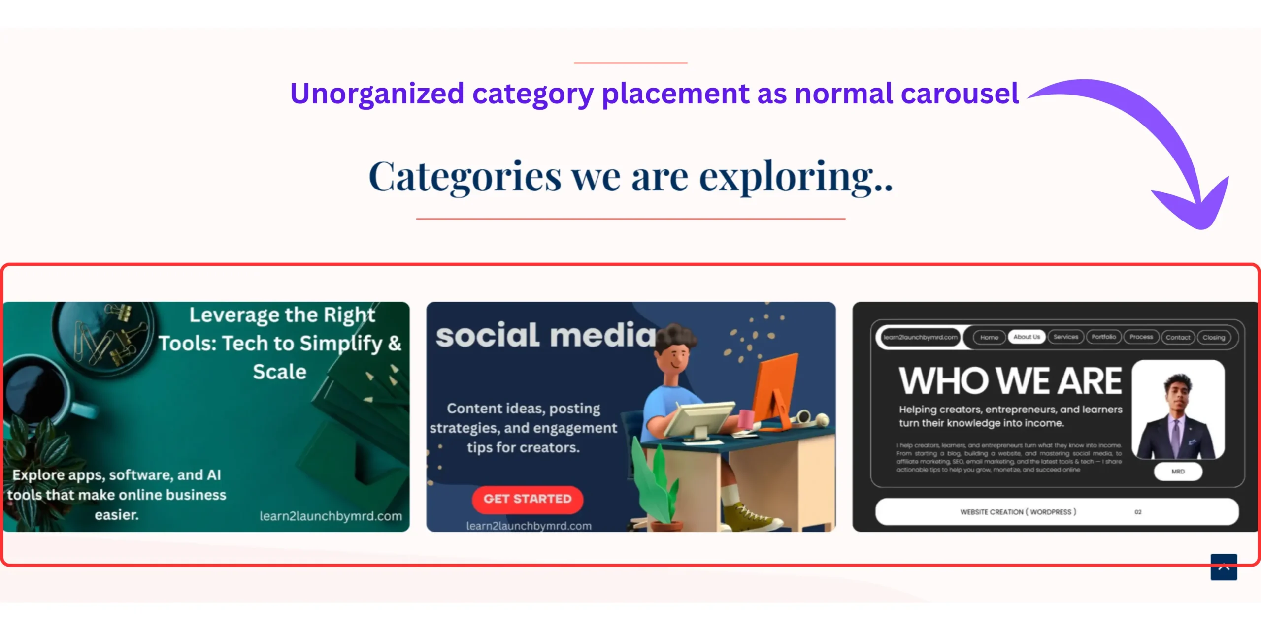
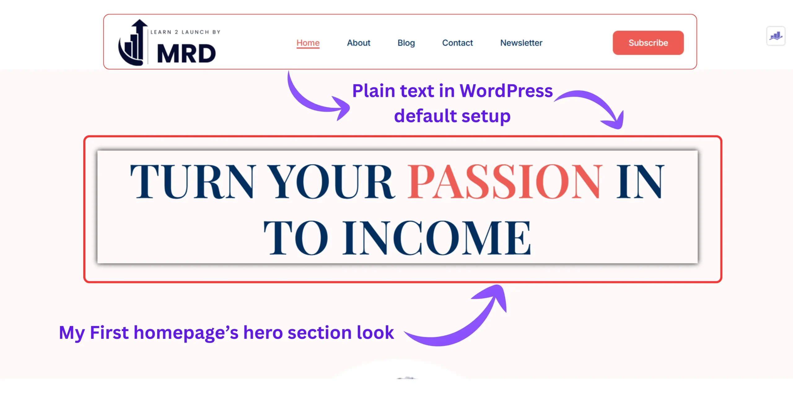
My homepage was WordPress’s default setup, a plain list of my five most recent blog posts, stacked horizontally – loop grid style, with no headline, no SEO optimized clear description of who I was, no category navigation, and no email opt-in anywhere on the homepage.
A visitor arrived, saw a post about WordPress hosting and a post about choosing a niche sitting next to each other with no context connecting them, and left.
My numbers at that point;
- Bounce rate : 78% (sometimes more than 85%)
- Average session duration : 48 seconds
- Email subscribers from homepage : 0 per week
After redesigning using the 5-layer blueprint in this guide :
My homepage had a clear hero headline, a trust bar, a value proposition paragraph, a six-card category grid, and a specific email opt-in offer.
The same traffic. A completely different experience.
- Bounce rate : 41%
- Average session duration : 4 minutes 12 seconds
- Email subscribers from homepage : 6 -11per week
Nothing else changed. No new content. No new traffic. Just the homepage structure.
That’s what this guide builds. And once you have your homepage converting, the next logical step is writing your first blog post so you have real content to send those new subscribers to.
What is the difference between a static page and a blog page in WordPress?
Quick answer :
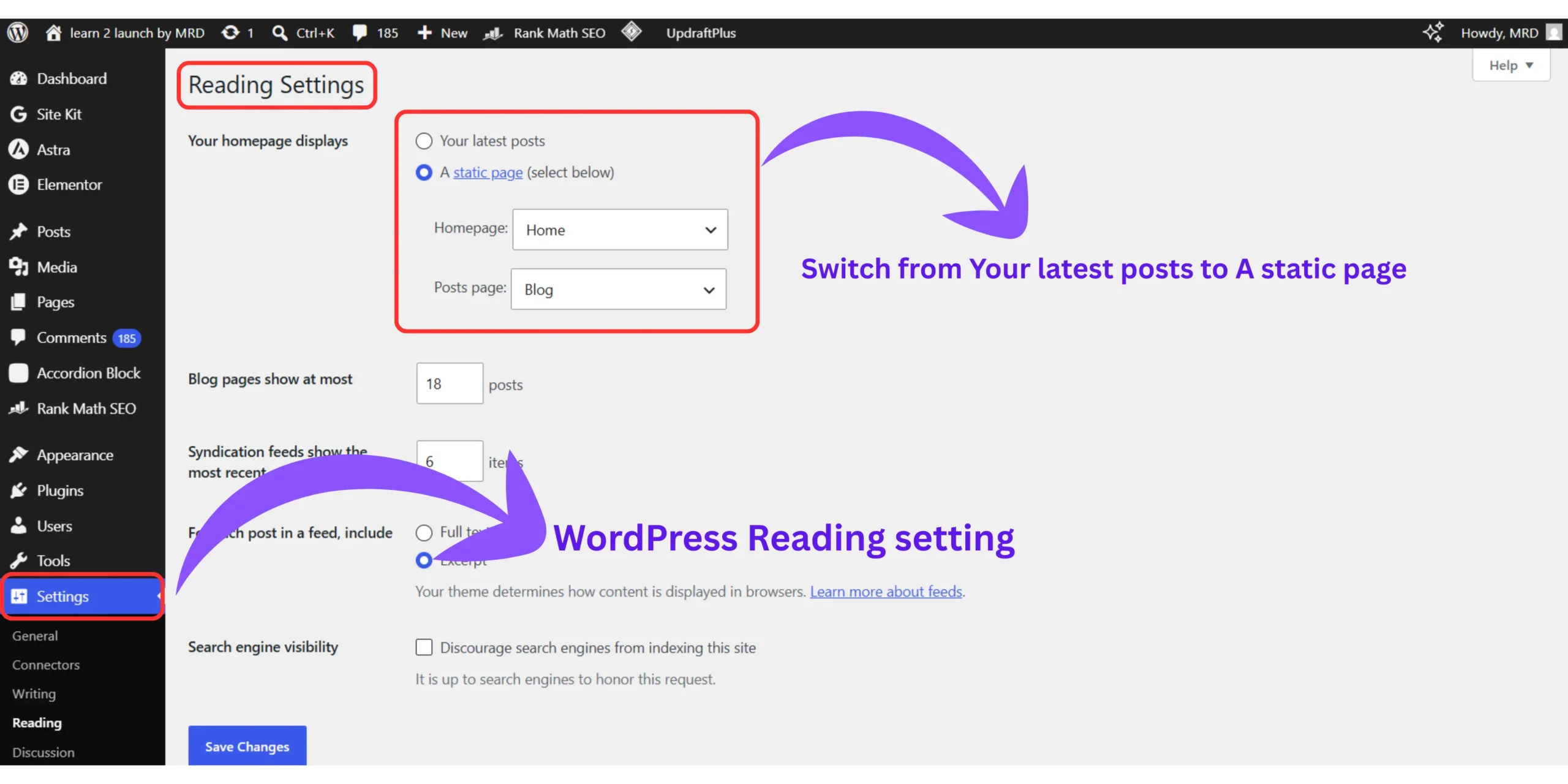
A static page is a custom-designed page you create and control. A blog page is an auto-generated feed of your posts in chronological order. You assign both under Settings → Reading in your WordPress dashboard.
This is the foundational concept behind everything in this guide.
Most beginners assume WordPress automatically shows whatever they design as the homepage. It doesn’t.
Here’s exactly how WordPress handles homepage by default:
- WordPress sets your homepage to display your latest posts automatically
- Any page you design sits in your Pages library doing nothing
- Even after hours of design work, visitors still see the raw post feed
- WordPress gives you zero visual warning this is happening
The two page types work like this:
- Static page – You design it. You control every headline, section, and button. Nothing appears on it unless you put it there.
- Blog page – WordPress controls it. It pulls your published posts automatically, newest first, with no design input from you.
For a beginner blog with under 50 published posts, a raw blog page as your homepage is one of the weakest first impressions you can make.
A static homepage gives you complete control and complete control is exactly what converts visitors into subscribers.
How to set a custom homepage in WordPress step by step
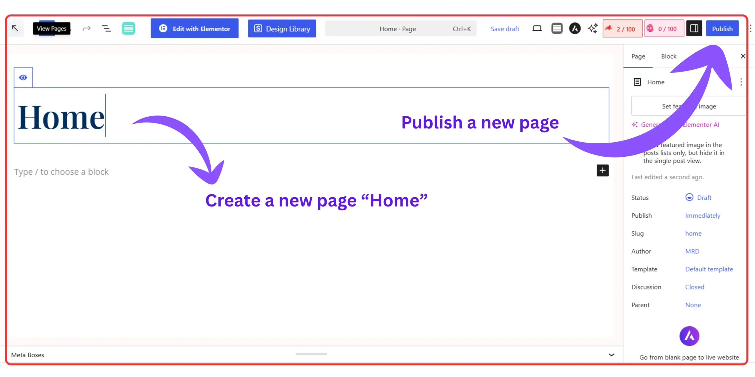
Quick answer : Go to Pages → Add New, create and name a blank page “Home,” then go to Settings → Reading, select “A static page,” choose your Home page from the dropdown, and save. Your designed page now shows at your domain.
Before you design a single section, complete this setup first.
If you skip this step and design first, your beautiful homepage will sit invisible in your Pages library while WordPress continues showing the post feed to every visitor.
Here is the exact sequence :
- Step 01 – Create your homepage. Go to Pages → Add New. Name it “Home.” Leave the content completely blank for now. Click Publish as a draft. Understanding how to create pages in WordPress properly at this stage saves you a lot of confusion later.
- Step 02 – Change the homepage setting. Go to Settings → Reading in your left sidebar. Under “Your homepage displays,” switch from “Your latest posts” to “A static page.” In the Homepage dropdown, select “Home.”
- Step 03 – Save and verify. Click Save Changes. Open your blog’s domain in a new browser tab. If you see a blank page instead of the post feed, the setup is working correctly. The blank page is your canvas.
- Step 04 – Open the page in Elementor. Go back to Pages → All Pages → Home and click “Edit with Elementor.” This is where the design happens.
- Step 05 – Build top to bottom. Always build your homepage from the top section down to the footer. Starting in the middle creates spacing inconsistencies that are frustrating to fix later.
The high converting blog homepage layout WordPress beginner actually need
Quick answer :
A high-converting blog homepage needs five core layers in this order – Hero Section, Trust Bar, Value Proposition, Category Navigation Grid, and Email Opt-In Section. Most beginner blogs are missing at least three of these five layers entirely.
Most WordPress homepage tutorials show you how to use a page builder.
Almost none show you what to actually build inside it and why each section exists.
The framework below is what I call the 5-Layer Blueprint. It’s the structure I rebuilt my homepage around, and it’s the same logical flow you’ll see on every high-performing beginner blog in the blogging niche if you look carefully.
I also cover the broader principles behind this in our guide on how to design a website layout with WordPress, but here we’re going deep on the homepage specifically.
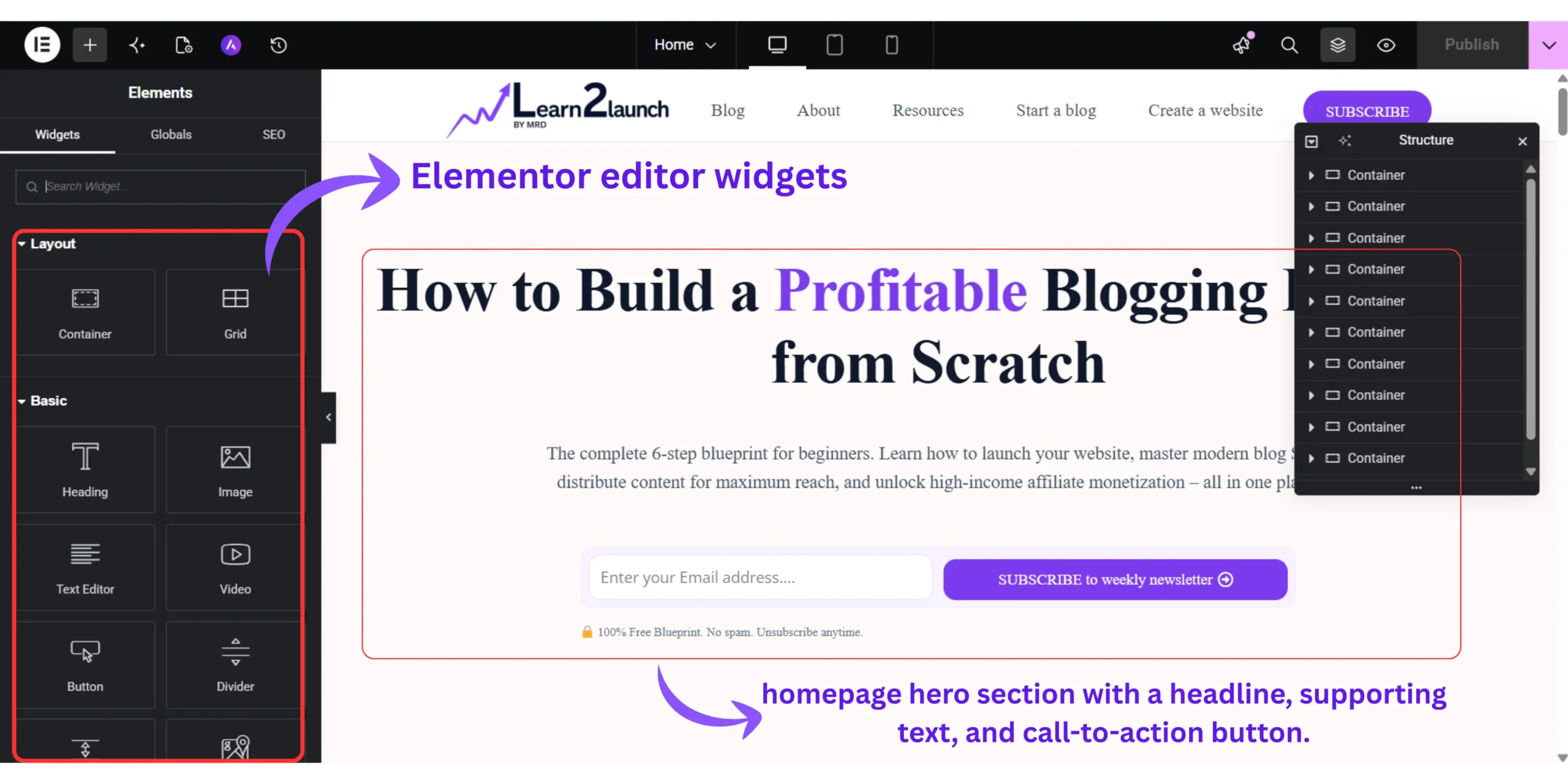
Layer 01 – The hero section (Your 5 second first impression)
The hero section is everything a visitor sees before they scroll.
It is the most important five seconds in your blog’s entire user experience. If your hero section doesn’t immediately tell a visitor who you help and what they’ll get, they leave and most of them never come back.
Your hero section needs exactly three things :
- A headline that tells visitors who this blog is for and what result they’ll get
- A one-sentence subheadline that expands on the promise
- One CTA button – not two, not three, one
What kills hero section on beginner blogs :
Headlines like “Welcome to My Blog” or “Hi, I’m [Name]” say nothing about the reader. Every word in your hero headline should answer the visitor’s silent question: “Is this for me?”
Weak headline: “Welcome to Learn 2 Launch” Strong headline: “Learn to Build, Grow, and Monetize a Blog — No Coding, No Confusion, No Agency Required”
The difference is specificity and who it speaks to. The strong version speaks directly to a beginner blogger’s exact fears and desired outcome in one sentence.
Your CTA button should link to your single most important free resource. One destination. One decision. One action.
Layer 02 – The trust bar (The section 90% of beginners skip)
This is the most commonly missing layer on beginner blog homepages — and skipping it is costing you subscribers.
The trust bar sits directly below your hero. It’s a narrow horizontal strip with three to five short credibility signals that answer the one question every new visitor silently asks before they scroll further: “Why should I trust this person?”
Examples of trust bar content:
- “Helping 2,400+ beginner bloggers since 2024”
- “Featured on [community, publication, or podcast]”
- Three icons representing your blog’s core topic pillars
- “4 years of documented hands-on experience”
You do not need massive numbers to build trust. Even “Helped 47 bloggers launch their first WordPress blog” is a legitimate, specific trust signal.
In Elementor build this with :
A Section block → Inner Section → three or four columns → short text or Icon Box widget in each column.
Keep the entire strip to one line of text per trust signal. The job of this section is quick confirmation, not explanation.
Layer 03 – The value proposition section (Tell them why this blog)
Your value proposition section is three to four sentences that explain what makes this blog different from every other blog covering the same topic.
This is not where you list your content. This is where you describe the transformation your reader will experience from reading it.
Weak version: “This blog covers WordPress, blogging tips, SEO, monetization, and affiliate marketing.”
Strong version: “If you’re a complete beginner who tried to start a blog and got lost in the technical jargon – this is where that confusion ends. Every guide here is written by someone who made every mistake you’re currently making, documented exactly what went wrong, and rebuilt everything from scratch. You get the honest path, not the highlight reel.”
The difference: The weak version describes your content. The strong version describes your reader’s experience and speaks directly to their frustration.
In Elementor build this with:
A two-column Section. Left column: Heading widget for a short hook headline + Text Editor widget for your three to four sentences. Right column: Image widget with a genuine photo of you or a simple illustrated graphic representing your blog’s transformation.
This section converts skimmers into readers. Readers into subscribers.
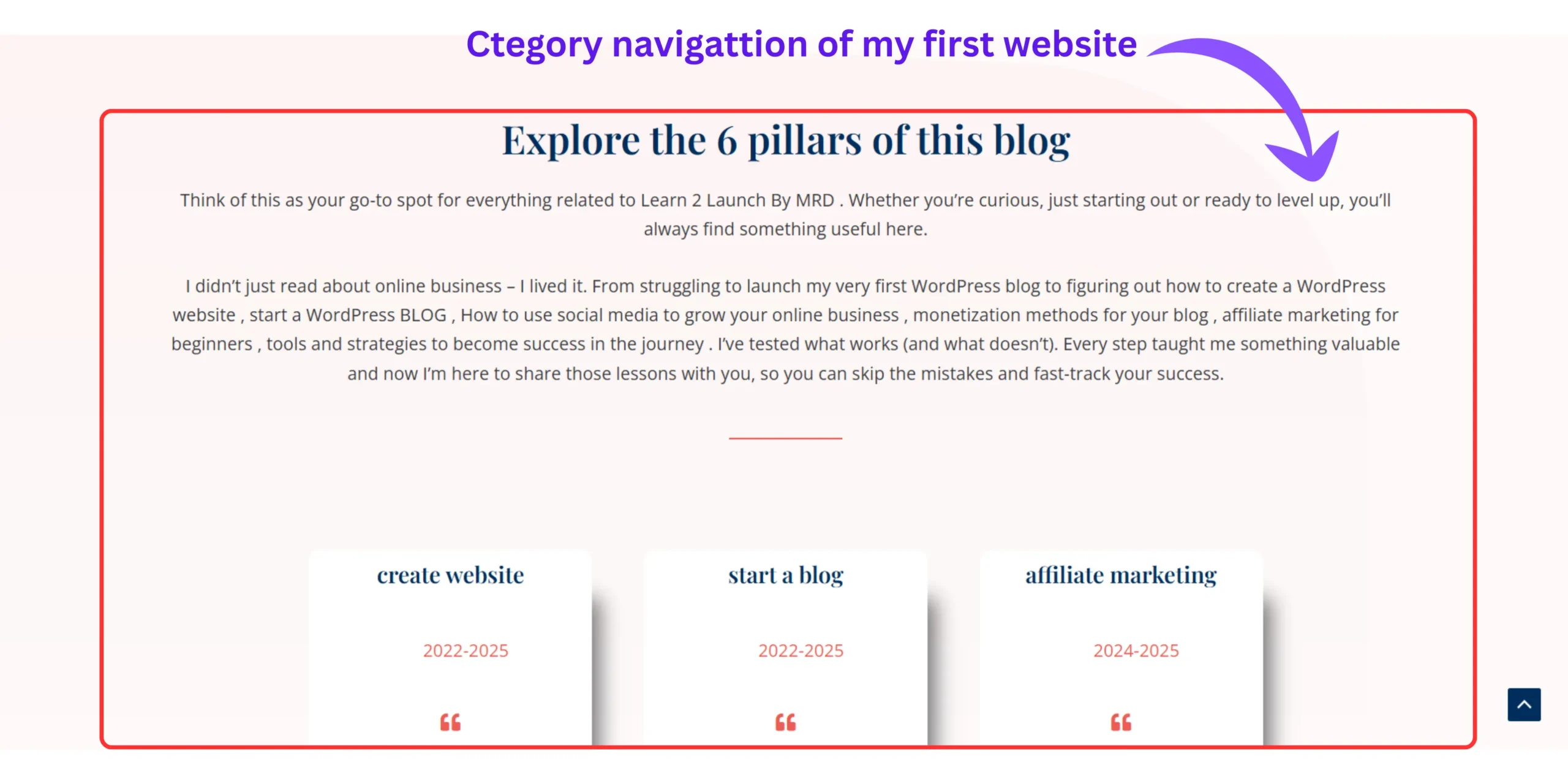
Layer 04 – The category navigation grid (Your content map)
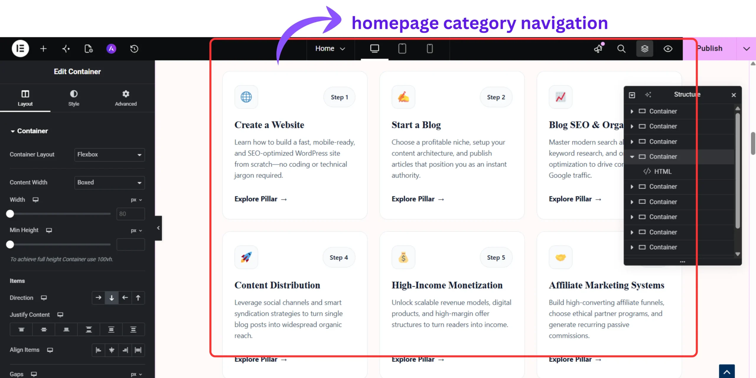
The category navigation grid shows visitors your full content universe so they have multiple reasons to stay – not just the one post they arrived on.
This single section is one of the biggest levers for reducing bounce rate on a beginner blog, because it shows a visitor at a glance that you cover their complete problem – not just one piece of it.
Build it as a grid of cards – one per blog category:
Each card needs:
- A simple icon or category image
- Category name as a short heading
- One sentence describing what that category covers
- A link to the category archive page
In Elementor, build this with:
A Section → Inner Section with three columns (for three categories) or two rows of three columns (for six categories) → Image Box widget inside each column. The Image Box widget handles icon, heading, and description in one block.
Link each card to its category page using the Button widget or by making the entire Image Box clickable through Elementor’s link settings.
Layer 05 – The email opt-in section (Your conversion engine)
Your email opt-in section is the most important conversion element on your entire homepage and the most commonly built wrong.
The mistake is making the offer generic.
Generic: “Subscribe to get the latest posts” → converts at 0.3–0.5% Specific: “Download the Free 5-Day Blog Launch Checklist – the exact steps I used to launch in one weekend, no coding needed” → converts at 3–6%
Same traffic. Same position on the page. The only difference is specificity of the offer.
In Elementor, build this with:
A full-width Section with a contrasting background color (not white – it needs to stand out from the rest of the page). Inside: Heading widget for your opt-in headline → Text Editor for two to three benefit sentences → HTML widget or Elementor Form widget for your email form embed code.
How to build each layer in Elementor – The exact widgets to use
Quick Answer: Each homepage layer maps to specific Elementor widgets. Hero → Cover Section + Heading + Button. Trust Bar → Icon Box or Text columns. Value Proposition → Two-column section + Heading + Text Editor. Category Grid → Image Box widget. Email Section → Form widget or HTML embed.
This is the section the previous version of this guide was missing — specific widget names so you’re never guessing inside Elementor.
Complete widget map for each layer:
| Layer | Elementor widget(s) |
|---|---|
| Hero section | Section (Full-width) → Heading → Text editor → Button |
| Trust bar | Inner section → Icon box * 3-4 columns |
| Value proposition | Inner section (2-column) → Heading + text editor → image |
| Category grid | Inner section → image box * 3-6 columns |
| Email opt-in | Section (Full-width , Colored) → Heading → text → form / HTML |
Before installing Elementor, make sure your theme is compatible. We cover exactly what to look for in our guide on how to choose the best WordPress theme for your blog. And before going live with any page builder, check our list of the 10 essential WordPress plugins you need before launching several of them directly affect how Elementor performs and how your homepage loads.
For advanced layout features – global design tokens, popup opt-in forms, sticky headers, motion effects, and access to 300+ professionally designed homepage templates, I upgraded to Elementor Pro.
It reduced my homepage build time from three hours to under 45 minutes using a pre-built site kit I customized with my own content. If you’re serious about your blog’s design from day one, it is the single tool upgrade that made the most visible difference on my site.
For the best results, also run through the 15 most common WordPress mistakes beginners make before publishing your homepage, several of them relate directly to page builder setup and are easy to avoid once you know they exist.
How do I make my WordPress blog homepage look professional?
Quick Answer:
Professional-looking WordPress homepages use a maximum of two brand colors plus one accent, consistent typography across all sections, generous white space between layers, and images that are either personal or specifically informational – never generic stock photos.
Design professionalism on a beginner blog comes down to restraint, not complexity.
The four design decisions that matter most:
01. Limit your color palette . Choose two primary brand colors and one accent color. Anything beyond three colors reads as visually chaotic to a first-time visitor. Set these as Global Colors in Elementor’s Site Settings so every widget uses them automatically.
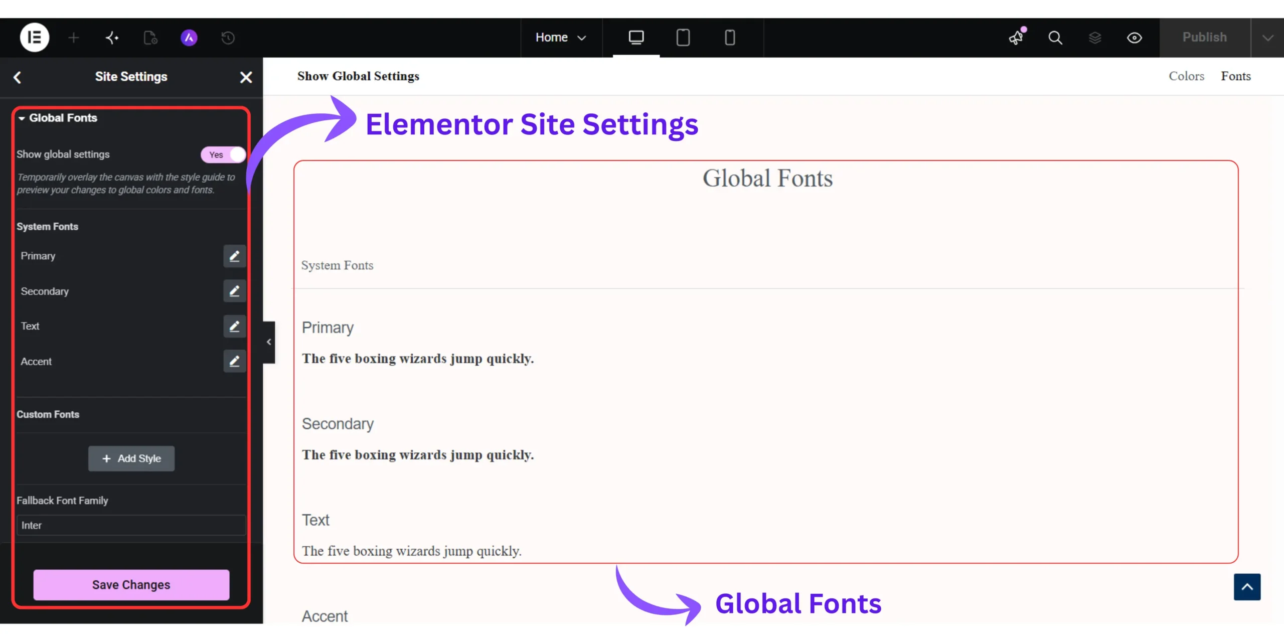
02. Use two fonts maximum. One font for headings, one for body text. Both should be readable at small sizes on mobile. Set these as Global Fonts in Elementor’s Site Settings so you never need to adjust font settings widget by widget.
03. Add white space intentionally. The most common beginner design mistake is packing sections too tightly because empty space feels “wasted.” It isn’t. Space between sections gives the eye a rest, makes the page feel premium, and actually makes text easier to read. In Elementor, increase Section Padding to at least 80px top and bottom on every layer.
04. Remove all stock photos from your hero. Generic stock images of laptops, coffee cups, and notebooks actively reduce trust on a beginner blog because visitors have seen them on hundreds of other sites, that half-second of “wait, I’ve seen this photo before” is enough to make your site feel like a template rather than a real person’s work. In my own testing across a few different hero sections, swapping a stock photo for a plain color background didn’t just look cleaner. It also cut my page load time by a noticeable margin, since I wasn’t loading a 200-400KB image just to greet visitors.
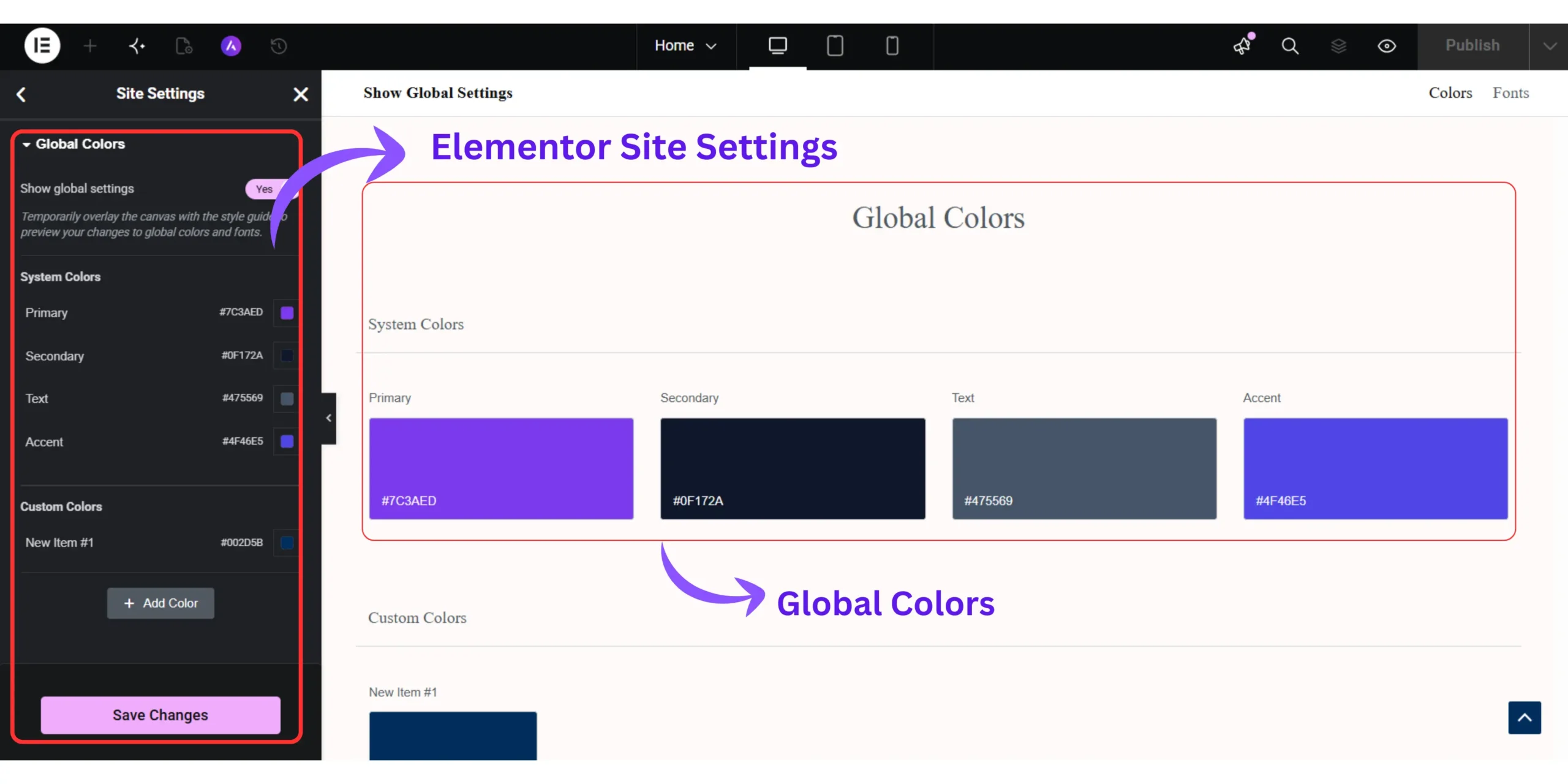
Use a solid brand color background, a genuine photo of yourself, or a clean graphic you created in Canva. If you go the color route, I’d skip eyeballing hex codes or digging through Google’s color picker, I use Color Drop.io to pick and test solid background colors for my hero sections. It’s a simple, no-fuss tool that lets you preview a color at full scale before committing, which matters more than it sounds: a shade that looks great in a tiny swatch can feel completely different filling an entire screen.
Authenticity consistently outperforms polish for new bloggers. A slightly imperfect photo of you or a clean color block signals “real person” faster than any stock image ever will and readers are quicker to trust a real person than a brand-shaped void.
Mobile homepage design – The part that cost most beginners their traffic
This is the section almost every WordPress homepage guide skips entirely. And it’s the one that may be costing you the most.
Over 60% of blog traffic arrives on a mobile device. If your homepage design breaks on a phone screen, the majority of your visitors never see the version you designed.
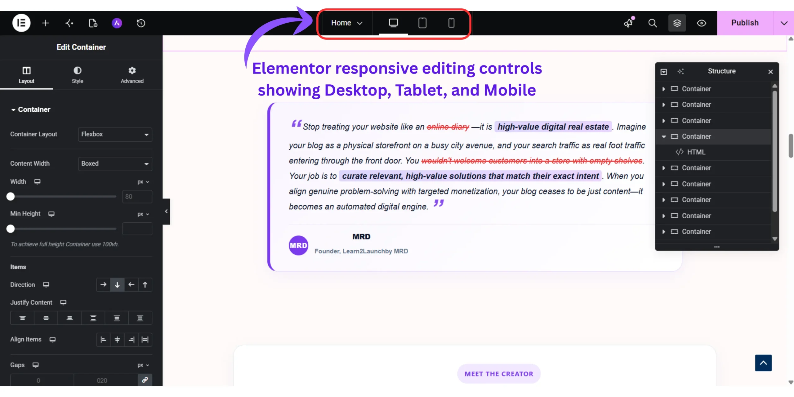
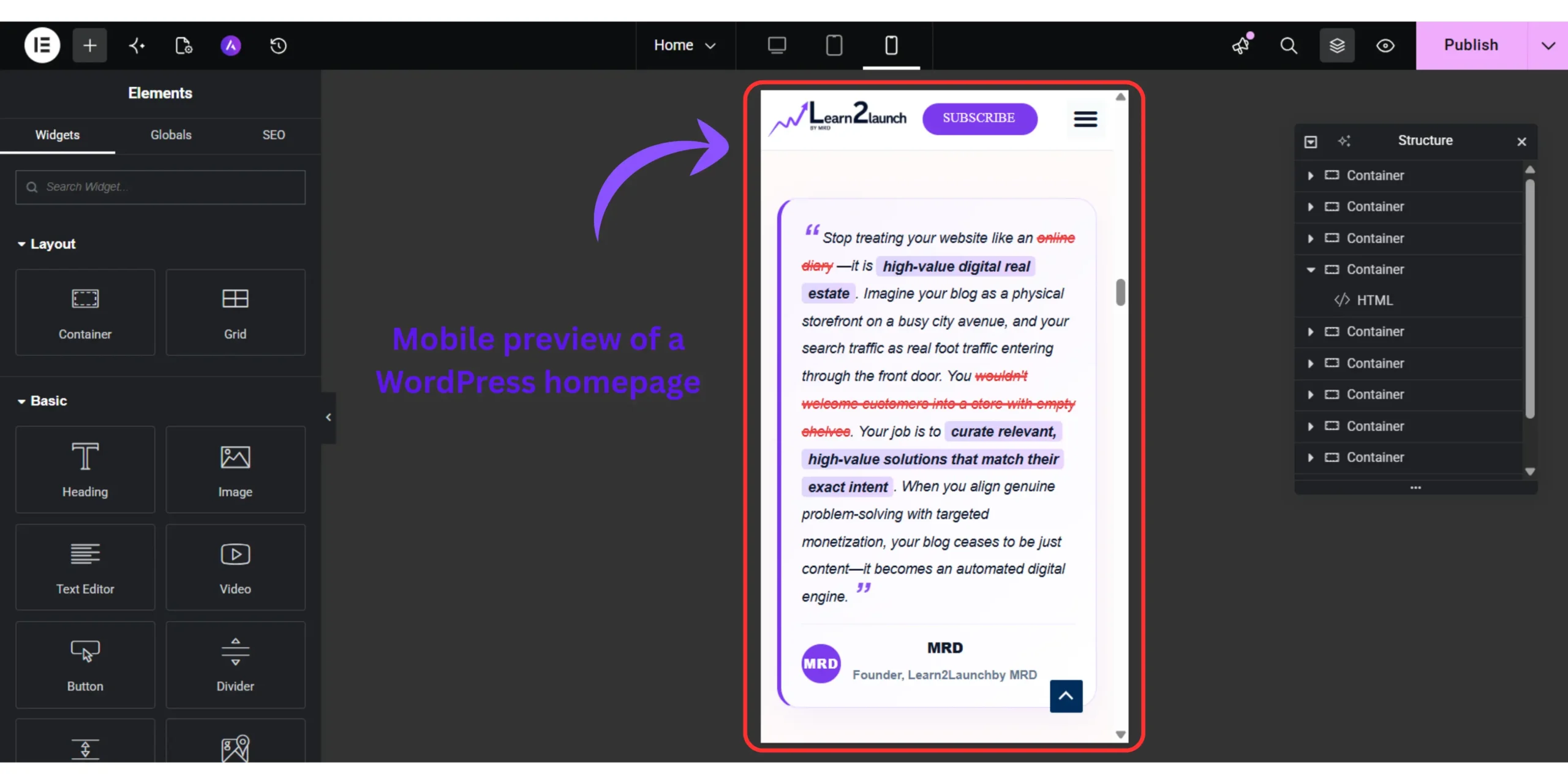
Elementor has a built-in responsive editor. After completing your desktop design, switch to mobile view using the device icons at the bottom of the Elementor editor panel. Don’t just preview, actively fix.
The three most common Elementor mobile homepage problems:
- Hero headline text is too large. A 72px headline that looks bold and clean on desktop becomes an overwhelming wall of text on a 390px phone screen. In Elementor’s mobile editor, reduce hero headline font size to 32–38px. Elementor applies this change to mobile only without affecting your desktop design.
- Multi-column sections stack poorly. Your six-column category grid looks great on desktop. On mobile, Elementor stacks those six columns vertically by default – creating a long, broken-looking scroll. Fix this by switching to a two-column layout in mobile view, or by using Elementor’s column order settings to control the stacking sequence.
- CTA buttons are too small to tap. A button that looks appropriately sized on desktop is often physically too small for a thumb tap on mobile. Set button height to a minimum of 44px on mobile — this is Apple’s minimum recommended touch target size and directly affects whether mobile visitors actually click through.
Also check your homepage page speed after publishing. A well-designed homepage that loads in 4+ seconds on mobile is effectively invisible to impatient visitors. Our full guide on how to speed up your WordPress website walks through the exact fixes that matter most for page-builder-built pages.
What nobody tells you about WordPress homepage design
Two things consistently missing from every WordPress homepage tutorial I’ve read and both of them cost me real traffic before I figured them out.
First : your homepage design directly affects your search rankings.
When I added too many Elementor sections, heavy images, and three custom font families to my homepage, my LCP score (Largest Contentful Paint – one of Google’s Core Web Vitals) jumped from 1.8 seconds to 4.6 seconds. That single metric shift was enough to affect how Google evaluated my page experience signals.
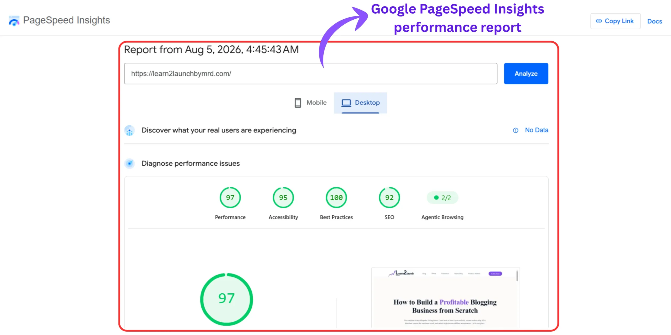
The fix wasn’t abandoning Elementor, it was optimizing properly. Use WebP images, limit custom fonts to two, and use a caching plugin.
Second : Your homepage is a security target.
Because it receives the most traffic, it’s the page attackers probe most often. After redesigning my homepage, reviewing how to secure my WordPress website was the first thing I did, specifically around login protection, file permissions, and malware scanning.
And before any of this matters, before the design, the speed, or the security. Make sure your blog has a clear, validated niche. No homepage layout will save a blog that isn’t built around a focused topic your target reader is actively searching for. If you haven’t locked that in yet, start with how to choose the perfect blog niche before investing hours into homepage design.
Related questions on how to design a blog homepage in WordPress without coding
Do I need Elementor to design a WordPress blog homepage without coding?
No – the free Gutenberg block editor that comes with every WordPress site can build a complete, professional homepage without any additional plugins.
That said, I use Elementor because it’s significantly faster and gives you more visual control. What takes 45 minutes in Gutenberg takes around 15 minutes in Elementor with better results.
My honest advice: start with Gutenberg if you’re just getting started. Switch to Elementor Free when you’re ready to level up the design, it installs on top of what you’ve already built without breaking anything.
Why is my WordPress Homepage still showing blog posts after I designed a custom page?
Because WordPress defaults to displaying your latest posts as the homepage until you manually change one specific setting most beginners never find.
Go to Settings → Reading, change “Your homepage displays” from “Your latest posts” to “A static page,” and select your designed page from the dropdown. Save changes.
That’s it. Your custom homepage will appear immediately. I spent an entire evening thinking my design was broken before I found this setting, don’t make the same mistake.
Should a blog homepage show latest posts or a static custom page?
For a beginner blog, a static custom page almost always outperforms a raw latest-posts feed.
A new visitor arriving at a chronological post list from a blogger they’ve never heard of has no reason to stay. A designed homepage tells them exactly who you are, who you help, and where to go next.
When I made the switch on my blog, average session duration increased noticeably within two weeks on the exact same traffic. The latest-posts setup only makes sense for high-frequency news or magazine blogs publishing multiple times daily.
How many sections should a blog homepage have?
Five to six sections is the sweet spot. More than seven typically hurts page speed and overwhelms visitors.
The five core sections every blog homepage needs are: hero, trust bar, value proposition, category navigation, and email opt-in. Each section should have one clear job.
I once ran a nine-section homepage that looked great in the editor but took 14 seconds to scroll through on mobile. My opt-in rate dropped. I cut it back to five sections and things improved. Less is almost always more on a homepage.
Can I design a professional WordPress blog Homepage completely for free?
Yes – using the Gutenberg block editor with a free theme like Kadence or Astra, you can build a professional homepage without spending anything.
Both themes include free starter templates you can import in one click and customize with your own content in under two hours.
The free route has one real limitation: advanced layouts require either extra Gutenberg tweaking or an upgrade to Elementor Pro or a premium theme. For a brand new blog, free is the right starting point. Invest in premium tools only once traffic data tells you what’s actually working.
Your WordPress Homepage won’t fix itself – Here’s where to start
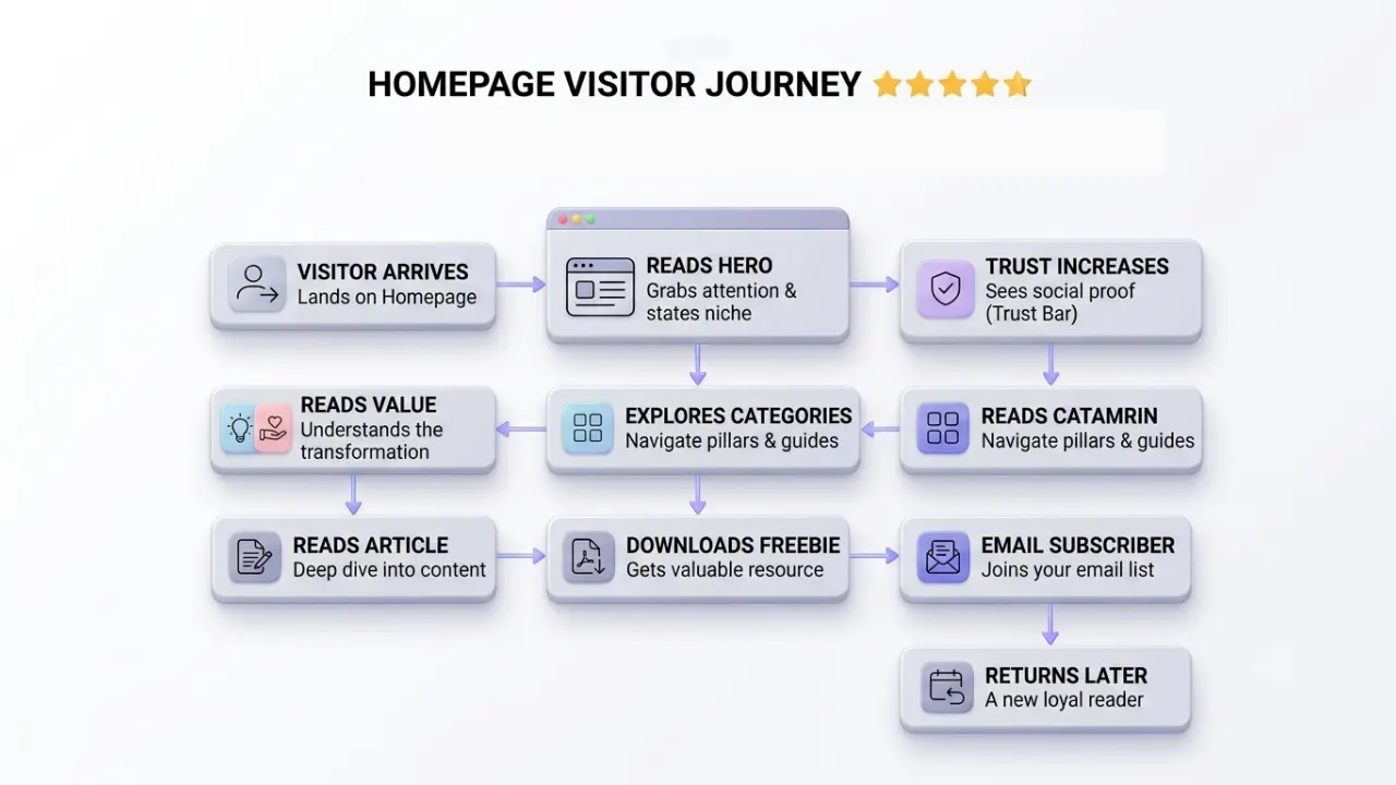
Learning how to design a blog homepage in WordPress without coding is one of the most leveraged things you can do as a beginner blogger — not because a beautiful page ranks better, but because it converts the traffic you already have into subscribers, returning readers, and eventually buyers.
My bounce rate dropped 35 percentage points and my average session duration increased from 48 seconds to over 4 minutes from one homepage rebuild. No new content. No new backlinks. No paid ads. Just structure.
The 5-Layer Blueprint, hero, trust bar, value proposition, category grid, and email opt-in, is not complicated. But it requires building all five layers, not just the ones that feel obvious. Most beginner blogs stop at one or two and wonder why their numbers stay flat.
Build one layer today. Come back for the next one tomorrow. Within a week you’ll have a homepage that works as hard as your best blog post.
Mastering how to design a blog homepage in WordPress without coding is a one-time investment that pays compounding returns for as long as your blog exists.
Start with the hero section. Get it live. Iterate from there.
Which of the five layers does your current homepage have — and which one are you building first?